One of the first thing that draws me as a reader to a book is the cover. As an author, I’m always curious about the design involved in a cover: the colors, the fonts, the imagery, etc. The covers I share here are not a promotion for the book itself, simply an admiration of the cover or aspects of it.
FOREVER FRIDAY, by Timothy Lewis
After a devastating divorce leaves Adam Colby heartbroken, he is not sure how he can put the pieces of his life back together. He wonders if even God can make sense of the mess that remains-until a package of mysterious postcards that direct Adam to the story of Gabe and Huck Alexander.
Drawn by her desire to find a true soulmate, Pearl “Huck” Huckabee breaks a turbulent engagement with her fiancé to marry Gabe Alexander, a man she’s known just a few short weeks. Wanting to celebrate and protect their love, Gabe mails her a meaningful postcard every week-beginning in 1926-for the next sixty years. Designed to arrive on Fridays, each postcard not only contains an original poem, but holds precious truths, the sum of which answer the universal question: what makes a marriage last? As Adam begins to uncover the Alexanders’ secret, he records Gabe and Huck’s extraordinary romance. It’s a process that will change his life forever.
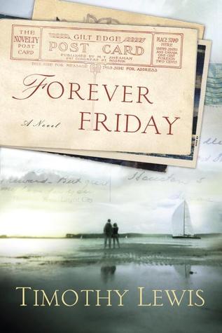
My impression: I love letters and postcards, so this cover immediately grabbed my attention when I was perusing the Goodreads and Amazon shelves. I don’t usually care for off-center alignment with fonts, but it works well here with the use of a postcard as a backdrop for the title. The handwriting superimposed over the sky reinforces the side of the plot told through postcards, and the couple on the beach give the cover both a romantic and a poignant air.
***
Cover Crush is a weekly series that originated at Flashlight Commentary. These lovely book bloggers also feature eye-catching covers: